

Working with images
An image upload and insertion system where photos are automatically converted to WebP, placed into content with a single click, configured through clear parameters, and help the business update pages faster without manual preparation of every block
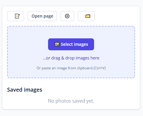
In our system, working with images is built to make uploading and using them as convenient as possible. Images are first attached to the page, and then just as easily inserted directly into the content with our own custom Markdown tag.
Nothing prevents the same images from being used on other pages of the website as well. When editing content, images attached to a particular page can be inserted with a single click at the position of the cursor in the editor. When the same image is needed on another page, it is enough to copy the image tag and insert it in the right place. And if necessary, we can easily improve this system even further.
Images can be uploaded in several ways: selected from a computer, added directly from a phone, dragged into the target area, or even pasted with Ctrl+V if the image is already in the clipboard. It is also possible to upload several images at once, not only one by one.
At the moment of upload, the system automatically converts images to the modern WebP format, which provides high quality at a smaller file size. The originals are preserved, so if needed it is easy to change the compression level later or keep the image in its original format.
Images inside X-MD blocks
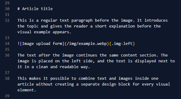
The image tag can be inserted directly inside an X-MD block. There is no need to type it by hand. In the editor, it is enough to choose the needed image from the uploaded list, and the system adds the tag into the content automatically at the cursor position.
On the site, this does not look like a technical insertion. It appears as a clean content block: the image becomes part of the article, and the text wraps around it nicely, which matters especially on large screens. On mobile devices, the image takes the full width and the text continues below it.
Text wrapping around an image
For a page to look good, it is not enough to insert an image. The text should wrap around it properly. That is why we developed a system that makes it easy to control the image position relative to the text. For the image, you can choose the position:
{.img-left}
{.img-right}
{.img-center}
.img-leftmeans the image is on the left and the text flows on the right..img-rightmeans the image is on the right and the text flows on the left..img-centermeans the image is centered, which is convenient for larger illustrations.
This makes the page look less monotonous and more alive: images can alternate left and right, central illustrations can be added, and long text can be broken by visual accents.
On wide screens, when there is not enough text to fill the space next to an image, you can also place +++ on a new line after the text with the embedded image. Then the next text will stop wrapping around the previous image and begin from a new line below it.
To separate text paragraphs even more visually, the standard Markdown tag --- can also be used. It works like <hr> in ordinary HTML. And if you want that separator to look not like a thin line, but for example like three stars or in some other style, we can easily adjust it for you.
Image size
If needed, the image size can be configured directly inside the tag itself:
{.img-left size=80}
The size parameter controls how large the image appears inside the text block. In this case, 80 means 80% of the original size.
This is convenient because there is no need to create a new version of the image every time, build a separate design, or manually edit CSS. It is enough to change the size parameter of the image tag inside the content.
Square crop and image focus
One of the biggest pain points when embedding images into content is that modern photos are usually horizontal or vertical. This creates extra difficulties when you need to place them cleanly inside a page.
The most convenient format to work with is a square image: square visuals can be arranged neatly in a grid and do not look too narrow or too tall on mobile devices.
But manually cropping an image into a square is extra work. And automatic square cropping can create another problem: the correct focal point may not sit in the center. The important detail may be above, below, to the left, or to the right.
That is why we built a system that removes those difficulties. We simply add the square key to the image tag. If the image is vertical, the system takes its original width and creates a square based on that width. If the image is horizontal, the system takes its original height and creates a square based on that height.
In many cases, that is already enough: the image becomes square and fits neatly into content or a grid.
But if the real center of the image is not where it should be, it can be corrected easily using extra keys:
x= for horizontal shift and y= for vertical shift.
{.img-right square y=-15}
{.img-right square x=10}
The value is measured relative to the center, so both positive and negative numbers can be used. Negative values are helpful when the focus must move left or downward.
If even on a square image the object you want to show still appears too small or shifted to one side, the zoom key can be used. It allows you to zoom into the image inside the frame, and then position the important object correctly using the x and y keys.
xmoves the image focus horizontally.ymoves the image focus vertically.
{.img-left square zoom=120 x=10 y=-15}
This makes it possible to crop an image carefully without preparing a separate file in a graphics editor.
Several images in a row
If several images are placed one after another, the system can automatically turn them into a neat grid and adapt them to the screen width:
{.img-left square size=80 zoom=120 x=10 y=-15}
{.img-left square size=80}
{.img-left square size=80 zoom=150 x=42}
At the same time, the .img-left or .img-right tag does not affect the placement of the images inside the grid. But it still needs to be present so the system recognizes that these are images rather than video blocks.
On the site, such images look tidy and are not scattered across the page randomly.
Alt text for images
The description of the image is placed inside the square brackets:
{.img-center}
This description matters for several reasons at once:
- it helps search engines understand the image better;
- it improves site accessibility for people using screen readers;
- it makes the content look more careful and professional;
- it helps when working with content to understand what is shown in the image.
That is why it is better not to leave the brackets empty, even though [] is technically allowed, but to provide a clear description instead.
Convenient for site growth
The main idea behind this system is to make working with images inside text simple, reliable, and comfortable for the user.
When you need to replace a photo, add a new illustration, prepare an article, a service page, or an instruction, there is no need to redesign the whole visual block. It is enough to insert the image in the right place and specify a few clear parameters.
Because of that, the website can be developed faster: new pages can be added, older materials can be refreshed, multilingual versions can be prepared, and a unified visual style can be preserved.
As a result, images become not awkward insertions, but a full part of the website's content system: neat, flexible, and convenient both for people and for AI models.